Typography Insights: Why Left-Aligned Text is Better
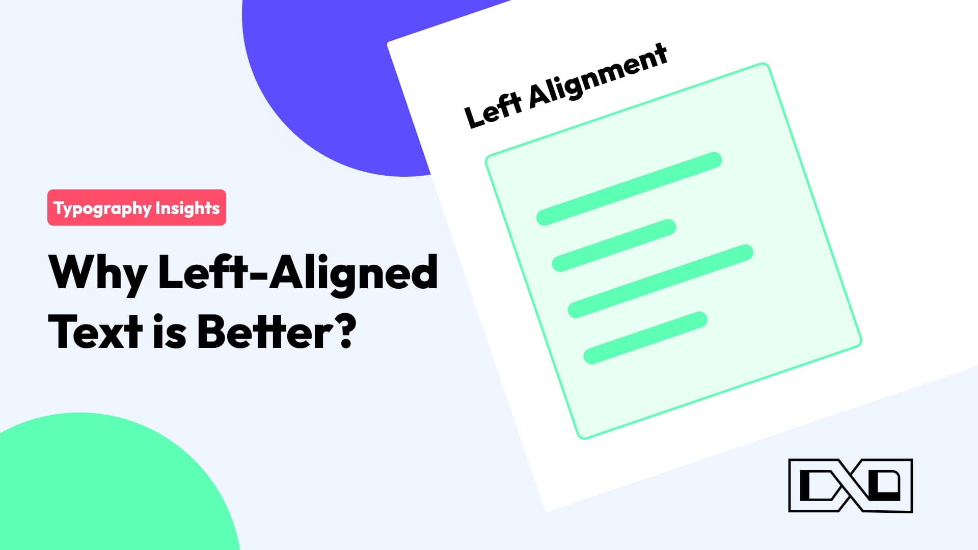
Left-Aligned Text: Where Clarity Meets Aesthetics
Have you ever wondered why some texts just look more appealing and easier to read? 🤔 It's all about alignment! Let's dive into the world of typography and explore why left-aligned text is a game-changer. 💡
🔍 Readability Matters 🔍 Left-aligned text follows a natural reading pattern for most languages, making it effortless for the eye to track and understand the content. It ensures a smooth flow of information from left to right, just like reading a book. 📖
📏 Consistency is Key 📏 Left alignment provides a consistent starting point for each line, which helps maintain a clean and organized appearance. This uniformity enhances the overall aesthetics of your design or document. 📊
💡 Emphasize Hierarchy 💡 Whether it's a list, a paragraph, or a headline, left-aligned text can help you convey a sense of hierarchy. Important information can be placed on the left for instant attention, guiding your readers through your content. 📝
🎨 Design Harmony 🎨 Left-aligned text complements various design elements, such as images, graphics, and other aligned objects. It creates a sense of balance and harmony that is visually pleasing. 🖼️
What's your take on text alignment? Do you prefer left-aligned text, or do you think there's a place for other alignments? Share your thoughts in the comments! 👇