Hey there, young designers! Today, we're going to dive into the exciting world of UI design fundamentals. Don't worry if you're new to this—let's break it down into bite-sized pieces so that it's super easy to understand. Are you ready? Let's go!
Note: Images within the article are not owned by us!
Whitespace
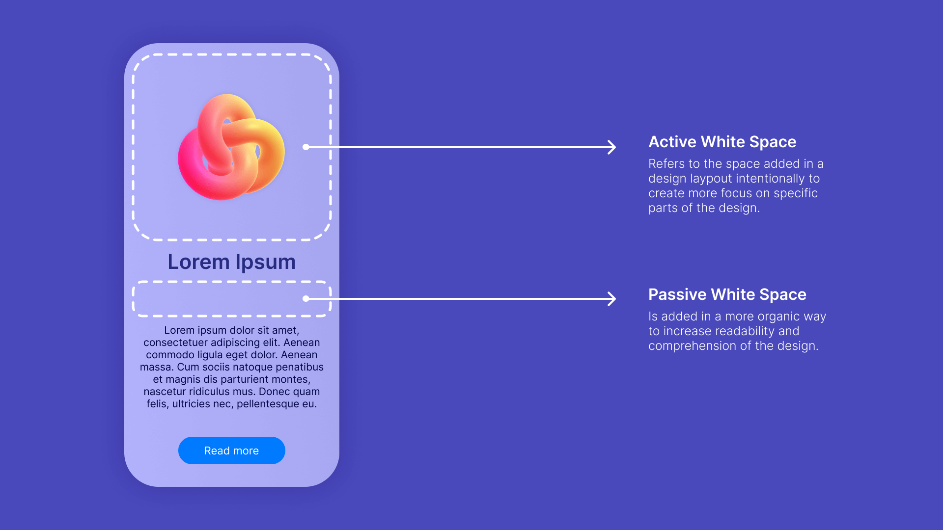
Imagine you're drawing a picture, and you have some space around your drawing. That space is like whitespace in UI design. It gives your website room to breathe and helps things look organized. It's like taking a deep breath before you start talking—it makes everything feel more balanced and clear.
Color

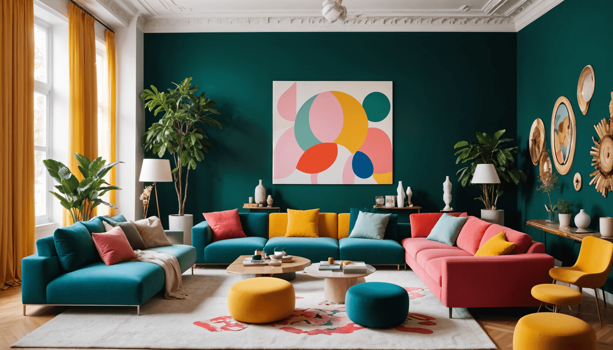
Colors are like the magic paint you use to make your website look cool and attractive. Just like how different colors can make you feel different emotions, colors in UI design can create different moods. So choose your colors wisely, like you would when picking out your favourite crayons.
Contrast
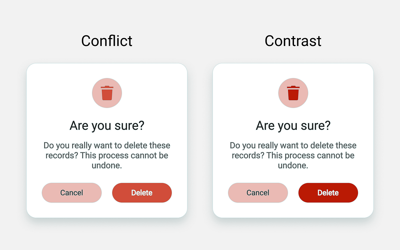
Imagine you're wearing a white shirt with dark pants. That contrast makes you stand out, right? Well, the same goes for UI design! Contrast means using different colors or shades that are very different from each other. It helps important things pop out and makes your website easier to read and navigate.
Alignment

Have you ever played with building blocks? When you stack them neatly on top of each other, they look much better, don't they? Well, in UI design, alignment is like lining up your building blocks. It means making sure things are evenly spaced and in straight lines. It helps your website look organized and professional.
Scale
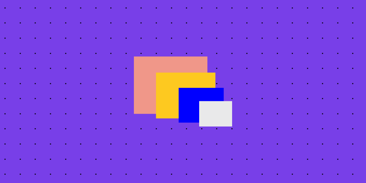
Imagine you have a tiny toy car and a huge truck. They're both vehicles, but they're different sizes, right? In UI design, scale is about making sure different elements on your website are the right size compared to each other. It helps create a sense of hierarchy and makes sure everything fits together nicely.
Proximity
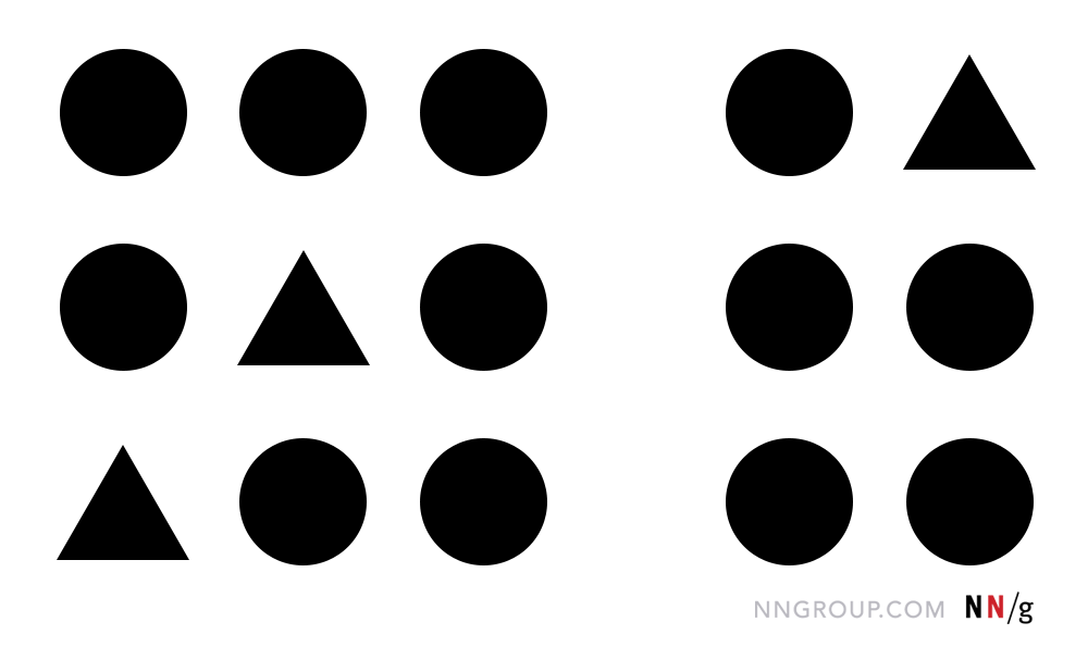
Imagine you're playing a game with your friends. You all want to stick together, right? Well, in UI design, proximity means keeping related things close to each other. It helps users understand that certain elements belong together and makes your website easy to navigate.
Visual Hierarchy

Imagine you're reading a storybook with different-sized headings. The biggest heading catches your attention first, right? Well, visual hierarchy in UI design is just like that! It's about making some elements more important than others by using size, colour, and placement. It guides users' eyes to the most important parts of your website.
And there you have it, young designers! These UI design fundamentals—whitespace, colour, contrast, alignment, scale, proximity, and visual hierarchy—are like your secret recipe for creating awesome websites. Remember, practice makes perfect, so keep experimenting and having fun with your designs. Happy designing!